Background
BookBub's Display Ads platform offers pay-per-impression/click ads to authors and publisher to advertise their books at controllable costs. They operate similarly to the ad products provided by Facebook and Google Adwords, but with an exclusive focus on ebook and audiobook advertising. A common workflow in these types of ad platforms is iterative, A/B testing to achieve optimal performance based on a variety of factors, including creative, audience targeting, and bid amounts.
As we began to plan our approach to improving the testing experience on our platform, we needed to decide where to focus our limit engineering, product, and design bandwidth. We had collected numerous pain points and suggestions for improvements from our users and partner account coordinators, but did not have a clear way to prioritize which we might prioritize first. I was tasked with organizing a design-led exercise with key stakeholders to establish areas of priority for the project.
Project Goals
• Prioritize design and engineering effort on existing, well-documented UX issues related to ads testing
• Leverage stakeholder expertise on effort, sizing, and impact to make informed prioritization decisions
Research
I first researched existing prioritization frameworks and design exercises that we might be able to use in our process. I started with one we have previously used at BookBub that has proved successful: a Difficulty/Importance Matrix
In this exercise, participants force-rank ideas on two axes: how difficult they would be to implement and how important they are to the goal of the project. This produces a four quadrant sort of the ideas, each with the action that should be taken on the ideas that land inside them.
This type of matrix felt like a good overall approach to our prioritization problem as it would create the type of binned output we were looking for. But the ranking dimensions did not feel appropriate for our set of inputs; we were trying to prioritize design problems, not design solutions, so judging difficulty/effort would be nearly impossible, especially for engineering led tasks.
Approach
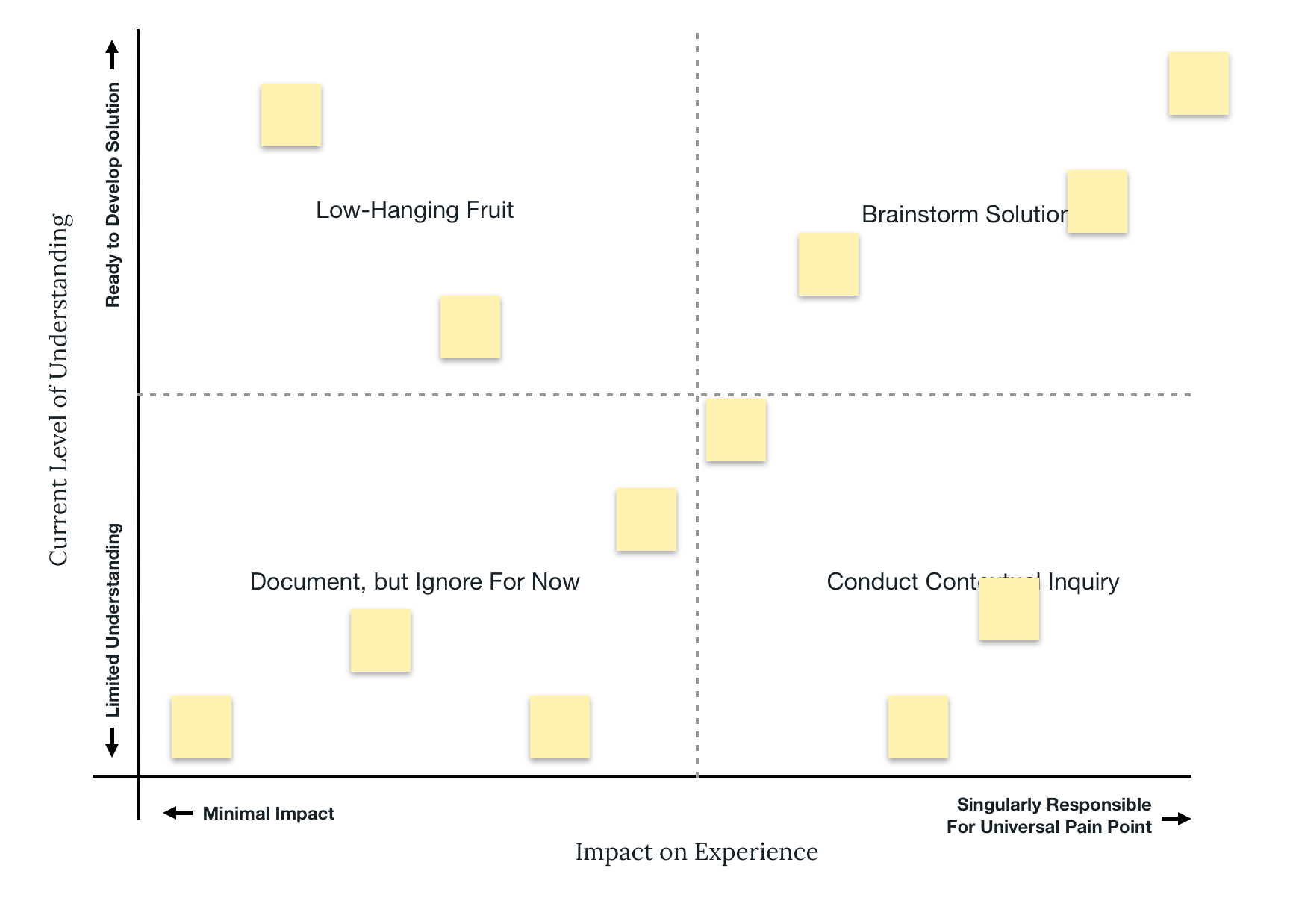
In order to adapt the Difficulty/Importance matrix to this problem, I adjusted the axes to better reflect the types of ideas we would be categorizing. On the x-axis, I refined "importance" to focus on the impact the problem has on the specific experience of ads testing. This effectively excluded other importance implications, like revenue and advertiser engagement, in order to focus on the impact to the user experience at hand. On the y-axis, I placed "Current Level of Understanding". This dimension reflected two key constraint of this project: 1) we knew there would be more problems than we would be able to address and 2) we wanted to start rolling out improvements to users ASAP. This dimension would therefore allow us to identify the most actionable issues to begin addressing immediately.

We began the exercise by force-ranking all issues along the x-axis

Then, we force ranked each issue along the y-axis

This naturally created four groupings of ideas, each with different next steps:
• Top Left: Minimal Impact/Well Understood - Low hanging fruit we could address immediately
• Top Right: High Impact/Well Understood - Problems we should focus design's attention on
• Bottom Left: Minimal Impact/Poorly Understood - Not worth addressing at this time, but document for further exploration
• Bottom Right: High Impact/Poorly Understood - Not immediately actionable, need more research to understand
We were then able to use these groupings to focus our attention on the issues that were best understood and whose solutions would be most impactful, while making immediate progress on low hanging fruit and initiating parallel progress on less-understood issues that might prove to be high impact.