Background
BookBub is, first and foremost, a platform for saving on books. The vast majority of user experiences center around promoting limited-time deals on ebooks. But there may only be a few hundred deals available at any given time, out of a global catalog of millions of books. So the service provides users with a wishlist, which they can use to mark books they are interested in purchasing and, in turn, BookBub will notify them when it has a deal on that title. Users can use this feature to avoid missing deals on books they want, without having to scan daily lists of active deals.
Project Goals
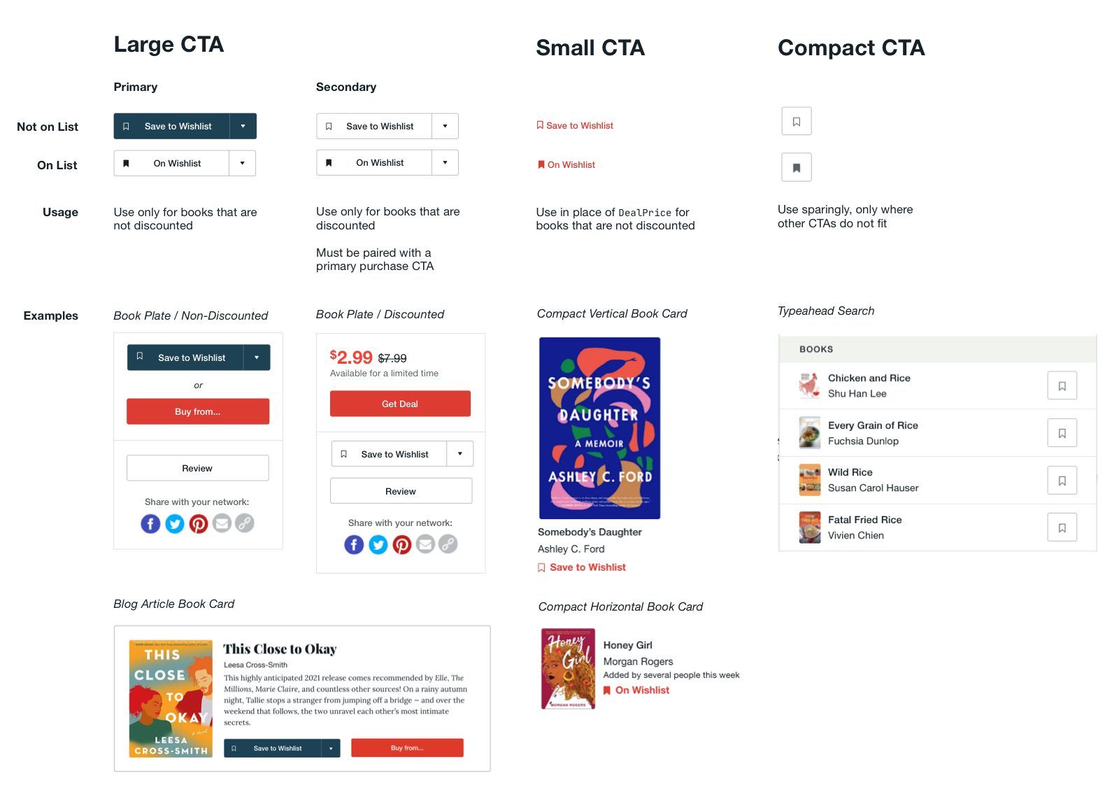
• Create a unified set of book-oriented UI elements that allow users to easily save books to their Wishlist
• Create copy and accompanying UI patterns to display educational content about Wishlist
• Establish a set of guidelines for when and how these UI elements should be shown
CTA System
Click image to enlarge
Case Study: Book Plate
One of the most prominent and frequently used Wishlist CTA is located in what we refer to as the "book plate", a collection of CTAs on the individual book pages (shown on the right in the screenshot below)
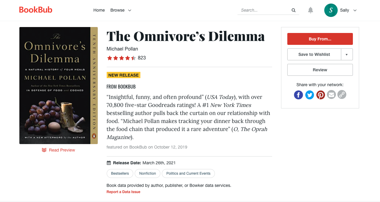
Wishlist and Buy CTAs
In the previous version of the book plate, we consistently prioritized the "Buy from..." button, which allows users to purchase from their choice of retailers, both in placement (top) and in treatment (primary, red button). This prioritization is appropriate for books that have active limited-time deals, since purchasing the book is in the best interest of the user (to save money) and the service (sell books). But it is not ideal in cases where there isn't an active deal on the book, because the user would often rather save the book to their Wishlist and wait for a price promotion to purchase the book at a discount.

In order to improve this experience, I wanted to envision ways to prioritize the Save to Wishlist button on non-deal books. The simplest way to accomplish this was to swap the retailer and wishlist CTAs:
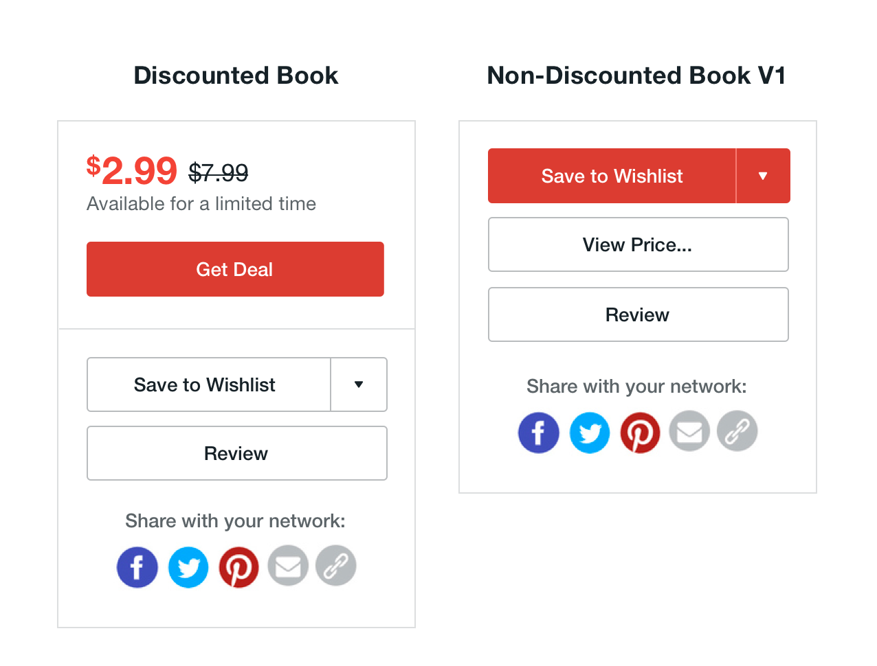
This treatment accomplished the primary goal of elevating the Save to Wishlist button, but suffers from two main drawbacks. First, reusing the red primary button treatment makes it difficult to determine at a glance whether there is a deal on the book or not, because the CTAs are visual indistinguishable despite having different functionality. Second, and more concerning from a business standpoint, this treatment severely diminishes the "buy" option. While it is often in the best interest of the user to wait for a book to be on sale to purchase it, there are situations where a user may want to purchase a book at full price; perhaps they need the book now for a class or book club, or maybe the book is a new release that they are enthusiastic enough about to pay full price. Regardless of intent, we want to allow a smooth path to purchasing a book in cases where users are motivated to do so.
My next iteration on the book plate attempted to address these issues, by using a secondary, but still prioritized treatment for the Save to Wishlist button:

This treatment allows for easy visual disambiguation between book state (blue button -> wishlist/not on sale, red button -> get deal/on sale) and softens the priority of the Save to Wishlist CTA against the buying option. But this treatment still somewhat discourages motivated users from purchasing due to the placement of the buy CTA.
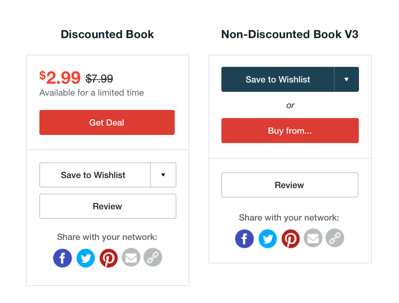
My final pass at the button placement brings the Save to Wishlist and Buy From.. CTAs into the same segment of the book plate, seperated by the word "or". This treatment presents the CTAs as mutually exclusive options for the user to select from: if you're interested in this book, either save it to your wishlist to buy it later when its on sale or if you want it now, buy it from your favorite retailer. Additionally, the Buy From.. button is re-elevated to a primary red treatment to both increase its prominence and maintain consistent with purchase CTA on book pages with active deals.
Wishlist Education
In addition to increasing the priority of the Wishlist CTA on non-deal book pages, we also saw an opportunity to use the book plate as a touchpoint to educate users about the wishlist feature. This is a key opportunity in the user's journey because they are looking to the CTA cluster to consider taking action on the book. By providing the right information and context, we can inform the users decision to wishlist or buy the book.
My first attempt at incorporating educational copy into the book plate leveraged the existing deal price treatment seen on the book pages of discounted books:
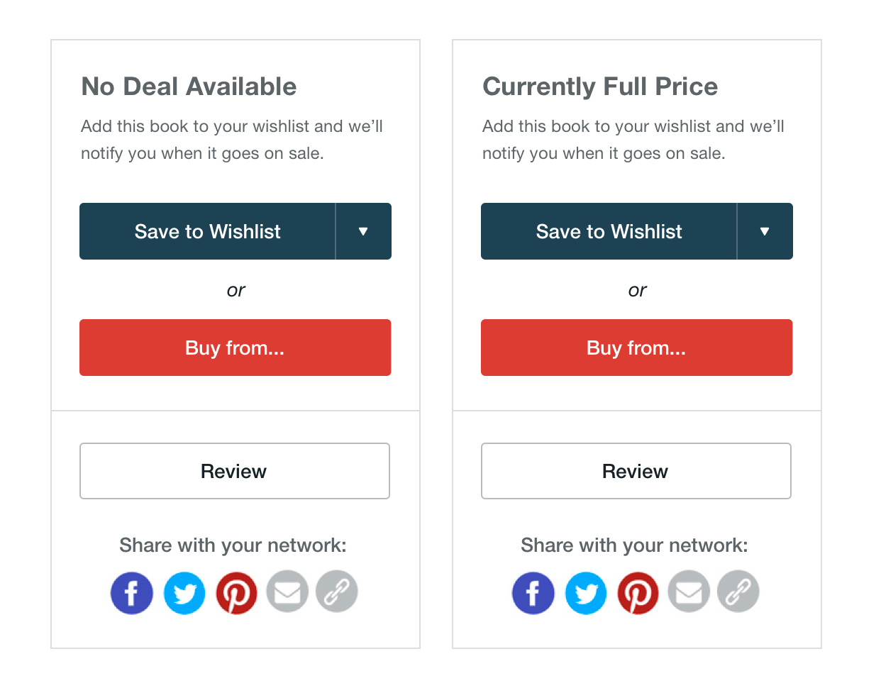
While this approach was nice for visual consistency, it suffered from two main drawbacks. First, this copy placement most naturally reflects the status of the book: the deal price for discounted books and message stating that the book is not discounted otherwise. But it proved difficult to develop copy that correctly captured the nuance of a non-discounted book's status. Although copy like "No Deal" or "Currently Full Price" felt somewhat appropriate, they did not clearly communicate that the books merely are not discounted by BookBub and not that they might be discounted elsewhere in the global sphere of retailers. This had the potential to erode user trust in the service if, for example, a user clicked through to a retailer to see that book was discounted there, but BookBub definitely stated that there was not a deal. Second, the copy would be present on every non-discounted book for the user's entire life on the service, regardless of if they already understood the feature.
In order to address these issues, my developed a dynamic and dismissible educational pattern that rides atop the book plate:
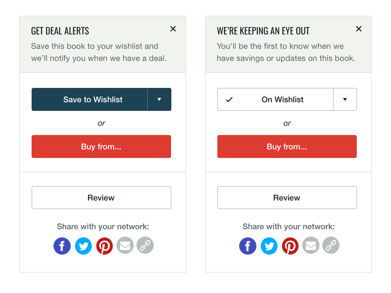
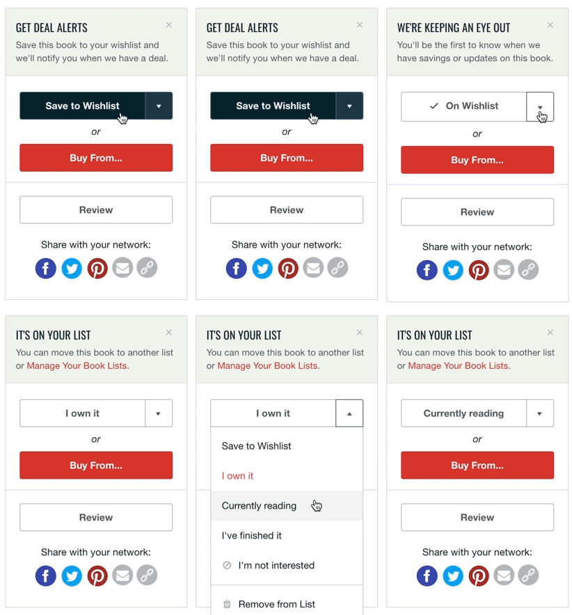
This design solution allows for more flexible explanatory copy and allows the user to remove the content once they have read it.
Together, the improved CTA treatment and educational content enables to make a better informed decision about what action to take on a book.
